Opened 12 months ago
Closed 10 months ago
#36386 closed New feature (fixed)
New styles for admin INFO and DEBUG messages
| Reported by: | Michał Pokusa | Owned by: | Michał Pokusa |
|---|---|---|---|
| Component: | contrib.admin | Version: | 5.2 |
| Severity: | Normal | Keywords: | admin message level info debug |
| Cc: | Triage Stage: | Ready for checkin | |
| Has patch: | yes | Needs documentation: | no |
| Needs tests: | no | Patch needs improvement: | no |
| Easy pickings: | no | UI/UX: | yes |
Description (last modified by )
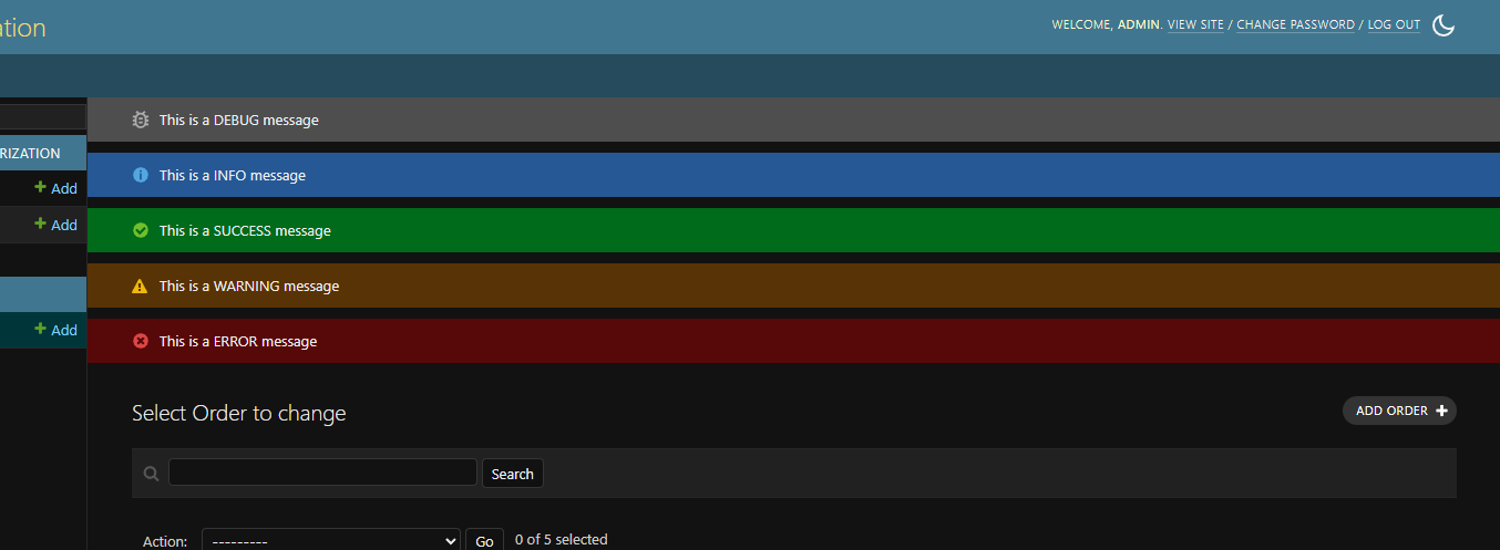
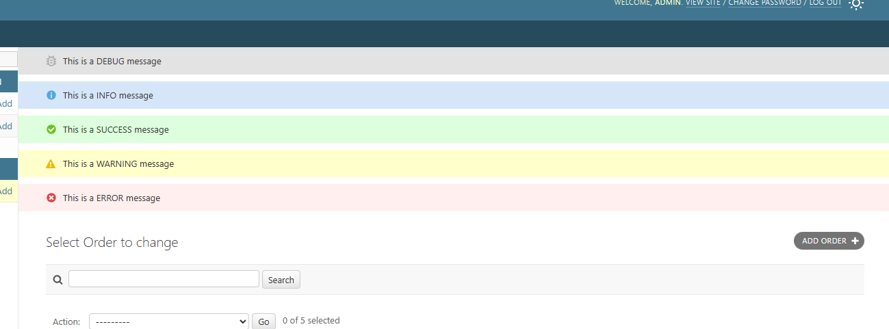
Would you be open to consider adding new styles for INFO and DEBUG messages levels in admin site? Currently they default to the green success one. Implementation would be very easy, and this addition would also be backwards compatible if the success one would be the default in e.g. modeladmin.message_user(...).
The main reason for this would be that there are separate styles for 3/5 DEFAULT_LEVELS from django.contrib.messages.constants and two are left without implementation.
I include screenshots to how this could look like:


If this gets accepted I would be happy to be assigned to this issue.
Change History (13)
comment:1 by , 12 months ago
| Description: | modified (diff) |
|---|
comment:2 by , 12 months ago
| Triage Stage: | Unreviewed → Accepted |
|---|
comment:3 by , 12 months ago
| Owner: | set to |
|---|---|
| Status: | new → assigned |
I think it's a good idea, and I really like the example images :)
comment:4 by , 12 months ago
Regarding the contrast, all combinations pass the AA requirements.
DEBUG (light theme): https://contrastchecker.com/?c=333333&b=e3e3e3
DEBUG (dark theme): https://contrastchecker.com/?c=eeeeee&b=4e4e4E
INFO (light theme): https://contrastchecker.com/?c=333333&b=ccefff
INFO (dark theme): https://contrastchecker.com/?c=eeeeee&b=265895
Also, do you think its worth to do a cleanup of .svg file names?
icon-yes.svg -> icon-success.svg
icon-alert.svg -> icon-warning.svg
icon-no.svg -> icon-error.svg
and following this naming, the following two would be added:
icon-debug.svg
icon-info.svg
comment:5 by , 12 months ago
| Has patch: | set |
|---|
comment:6 by , 12 months ago
| Patch needs improvement: | set |
|---|
Also, do you think its worth to do a cleanup of .svg file names?
I think these are also used for things like a boolean in the list view (hence "yes/no"). I would worry if these names are depended on in other places, so I would keep them
comment:7 by , 11 months ago
| Patch needs improvement: | unset |
|---|
I have commented on the prevoius review and suggested fixes for problems that were noticed.
In order to proceed I would need someone to review the comments and decide on the next steps.
comment:8 by , 11 months ago
| Patch needs improvement: | set |
|---|
comment:9 by , 10 months ago
| Patch needs improvement: | unset |
|---|
I have adjusted the PR to the changes from #36437. Your input on ther choice of the debug icon would be really appreciated, I have suggested two selected from Font Awesome in the comment on PR.
comment:10 by , 10 months ago
| Needs documentation: | set |
|---|
Think we need a release note within 6.0 backwards incompatible changes (noting that folks can explicitly use the success style to maintain their old style)
comment:11 by , 10 months ago
| Needs documentation: | unset |
|---|
comment:12 by , 10 months ago
| Triage Stage: | Accepted → Ready for checkin |
|---|
New icons for errors and warnings was added in #12803, it's not clear why info and debug were excluded (I assume these having a tick is less strange than an error or warning)
I think it makes sense for styles to be added here as it feels like something that was missed. You will need to check the color contrast for accessibility purposes