#36437 closed Bug (fixed)
Improve accessibility of messages in admin.
| Reported by: | Sarah Boyce | Owned by: | Michał Pokusa |
|---|---|---|---|
| Component: | contrib.messages | Version: | 5.2 |
| Severity: | Normal | Keywords: | accessibility |
| Cc: | Eliana Rosselli, Thibaud Colas, Sarah Abderemane, Tom Carrick | Triage Stage: | Ready for checkin |
| Has patch: | yes | Needs documentation: | no |
| Needs tests: | no | Patch needs improvement: | no |
| Easy pickings: | no | UI/UX: | yes |
Description (last modified by )
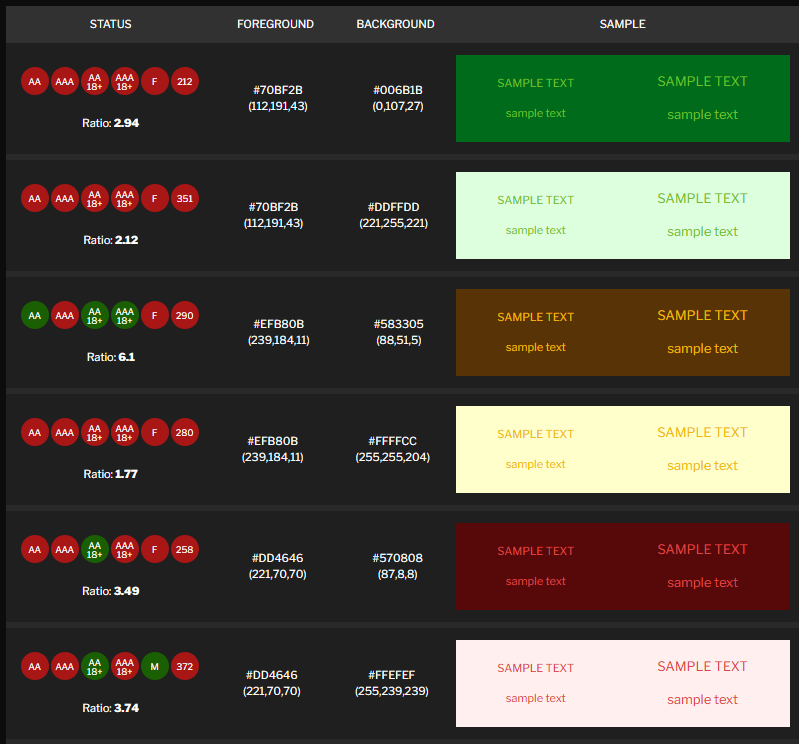
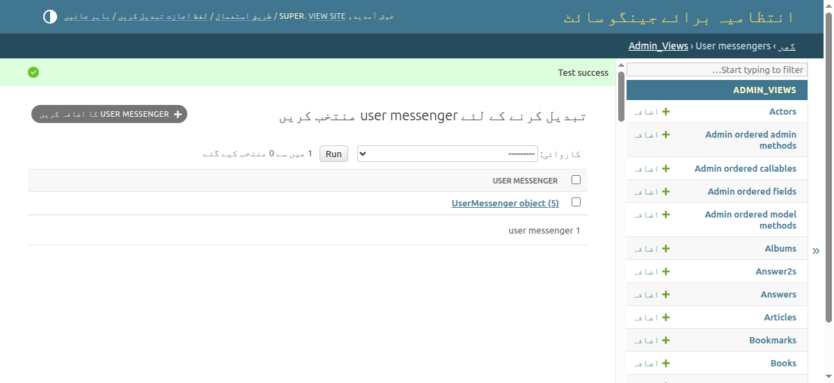
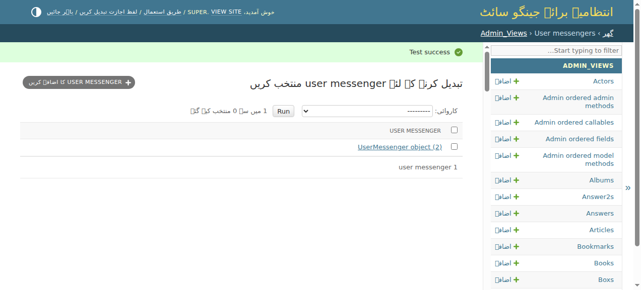
- The message icons in RTL languages should be on the right

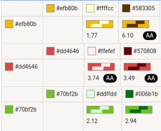
- The color contrast of the success message (yes icon) fails the AA guidelines in both light and dark mode. The warning message (alert icon) fail the AA guidelines in light mode.

- In forced colors mode, the message probably needs a border. Note that this can be partially acheived by giving a bottom border to the header breadcrumbs

Attachments (6)
Change History (21)
by , 14 months ago
| Attachment: | image-20250604-151433.png added |
|---|
by , 14 months ago
| Attachment: | image-20250604-151446.png added |
|---|
by , 14 months ago
| Attachment: | image-20250604-151500.png added |
|---|
comment:1 by , 14 months ago
| Description: | modified (diff) |
|---|
comment:2 by , 14 months ago
by , 14 months ago
| Attachment: | image-20250604-154457.png added |
|---|
comment:3 by , 14 months ago
| Description: | modified (diff) |
|---|
follow-up: 6 comment:4 by , 14 months ago
Can I please claim/be assigned to this issue, I have a concept on how this could be resolved and already working on PR.
follow-up: 7 comment:5 by , 14 months ago
| Triage Stage: | Unreviewed → Accepted |
|---|
I remember seeing related work in this ticket. I agree, it's something that needs improvement.
comment:6 by , 14 months ago
| Owner: | set to |
|---|---|
| Status: | new → assigned |
Replying to Michał Pokusa:
Can I please claim/be assigned to this issue, I have a concept on how this could be resolved and already working on PR.
by , 14 months ago
| Attachment: | test_messages--success--high_contrast.png added |
|---|
by , 14 months ago
| Attachment: | test_messages--success--rtl.png added |
|---|
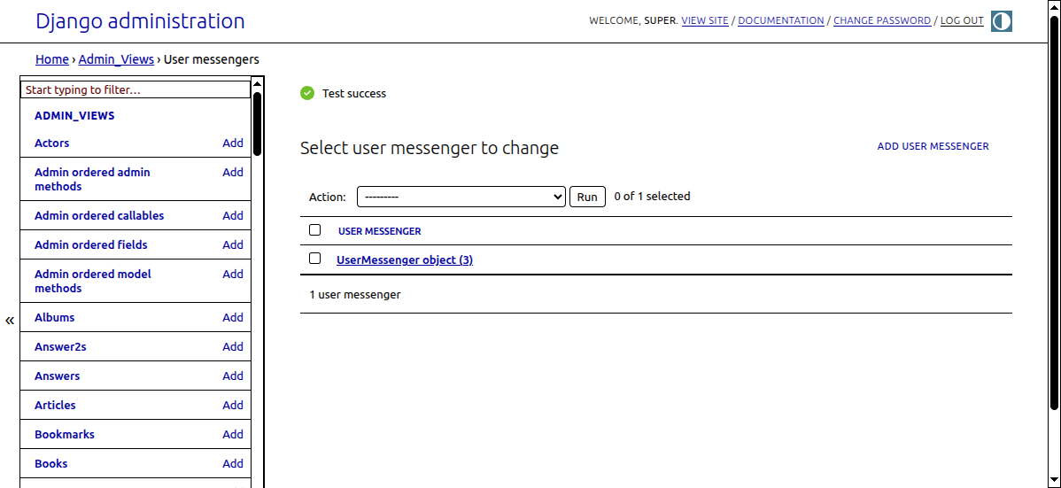
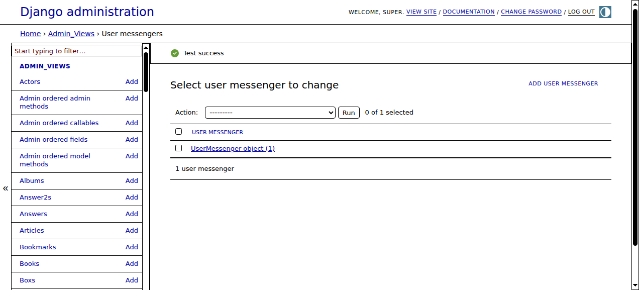
comment:7 by , 14 months ago
Replying to Antoliny:
I remember seeing related work in this ticket. I agree, it's something that needs improvement.
Yes, this is the prerequisite for that PR, I understand that after this is resolved, it would be time to proceed with new styles.
Below I attached screenshots of how messages look like after the changes.
The contrast one was a bit more tricky, and I resolved it by making a sprite-like svg both both themes, similar to icon-calendar.svg. This approach required some modification of the message HTML. Of course the colors used can be changed, I just used ones that meet the AA guidelines.


comment:8 by , 14 months ago
| Has patch: | set |
|---|---|
| UI/UX: | set |
comment:9 by , 14 months ago
| Needs tests: | set |
|---|---|
| Patch needs improvement: | set |
comment:10 by , 14 months ago
| Needs tests: | unset |
|---|---|
| Patch needs improvement: | unset |
comment:11 by , 13 months ago
| Triage Stage: | Accepted → Ready for checkin |
|---|
Note that the following screenshot test can be used to generate screenshots for testing
tests/admin_views/tests.py