Opened 10 months ago
Last modified 9 days ago
#36630 assigned Bug
Semantic structure and accessibility improvements for the admin navigation sidebar.
| Reported by: | Antoliny | Owned by: | Antoliny |
|---|---|---|---|
| Component: | contrib.admin | Version: | 5.2 |
| Severity: | Normal | Keywords: | accessibility |
| Cc: | Eliana Rosselli, Thibaud Colas, Sarah Abderemane, Tom Carrick, Brigid Metuh | Triage Stage: | Accepted |
| Has patch: | yes | Needs documentation: | no |
| Needs tests: | no | Patch needs improvement: | no |
| Easy pickings: | no | UI/UX: | no |
Description (last modified by )
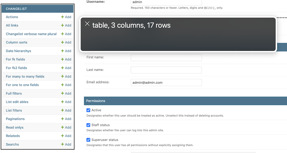
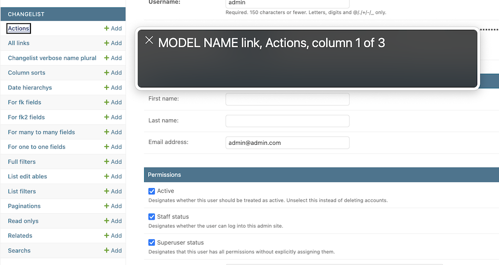
Currently, the admin navigation sidebar is built using <table> tags.
I don’t think this structure is appropriate from an accessibility perspective.
It has the following issues:
- When accessing the sidebar, it is described as a table, but I’m not sure if the structure that users imagine when they hear “table” matches the actual structure of the sidebar.

- When accessing a row element, the table structure provides a description of which column each item is in. However, since the sidebar does not have the last column, users expect three items in a row, but in reality, only two items are accessible.

- When navigating elements with a screen reader, they are traversed in the wrong order.
Currently, when using the standard element navigation of a screen reader, it moves to the end of the table without accessing the internal elements.
I suspect this issue might be caused by the <a> tag being placed directly under the table.
- Incorrect navigation order during tab navigation.
When using tab navigation, we would expect to navigate from the app to the models under it, but in reality, the models are navigated first, and the apps for those models are navigated last.
To resolve this issue, I believe the structure of app_list(sidebar, index, app index), should be changed to <h>, <ul>, <li>.
Attachments (2)
Change History (12)
by , 10 months ago
| Attachment: | table_wrong_description.png added |
|---|
by , 10 months ago
| Attachment: | table_wrong_description_2.png added |
|---|
comment:1 by , 10 months ago
| Owner: | set to |
|---|---|
| Status: | new → assigned |
comment:2 by , 10 months ago
| Description: | modified (diff) |
|---|
comment:3 by , 10 months ago
| Description: | modified (diff) |
|---|
comment:4 by , 10 months ago
| Cc: | added |
|---|---|
| Triage Stage: | Unreviewed → Accepted |
comment:5 by , 4 weeks ago
| Has patch: | set |
|---|
comment:6 by , 3 weeks ago
I have submitted a pull request for this issue here: https://github.com/django/django/pull/21562. All linting and test workflows are passing successfully!
comment:7 by , 3 weeks ago
| Patch needs improvement: | set |
|---|
comment:8 by , 10 days ago
| Patch needs improvement: | unset |
|---|
comment:10 by , 9 days ago
| Cc: | added |
|---|
I saw an agreement that this should be improved within #accessibility in the Discord channel. It may make sense to agree the semantic structure/design before this is picked up