Opened 12 months ago
Last modified 5 months ago
#36513 closed Bug
Background color for admin's m2m multi-select "selected" rows is broken in Edge — at Version 5
| Reported by: | cjs59 | Owned by: | |
|---|---|---|---|
| Component: | contrib.admin | Version: | 5.2 |
| Severity: | Normal | Keywords: | accessibility |
| Cc: | Antoliny | Triage Stage: | Ready for checkin |
| Has patch: | yes | Needs documentation: | no |
| Needs tests: | no | Patch needs improvement: | no |
| Easy pickings: | yes | UI/UX: | no |
Description (last modified by )
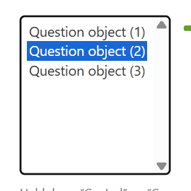
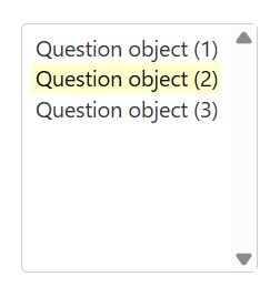
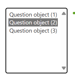
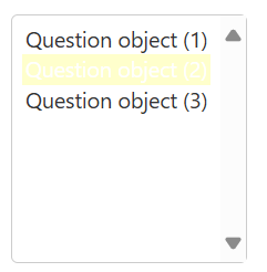
The change in https://code.djangoproject.com/ticket/35809 has made the selected item hard to read in Microsoft Edge, as it displays as white text on a yellow background when the m2m widget is not in focus. Chrome and Firefox both display it as black text on a yellow background. When the user clicks on the m2m widget, it changes to use the browser's built-in colours: white text on dark grey for Edge, and white text on blue for Chrome/Firefox.
I am attaching screenshots to show the focused and unfocused colours in both Edge and Chrome.
Adding the following to a custom CSS file fixes Edge so the unfocused widget renders the same as in Chrome:
form .aligned select option:checked {
        color: var(--body-fg);
}
Chrome focused

Chrome unfocused

Edge focused

Edge unfocused

Edge focused(dark)

Edge unfocused(dark)

Change History (11)
by , 12 months ago
| Attachment: | Chrome-focused.png added |
|---|
by , 12 months ago
| Attachment: | Chrome-unfocused.png added |
|---|
by , 12 months ago
| Attachment: | Edge-focused.png added |
|---|
by , 12 months ago
| Attachment: | Edge-unfocused.png added |
|---|
comment:1 by , 12 months ago
| Description: | modified (diff) |
|---|
comment:2 by , 12 months ago
| Component: | Uncategorized → contrib.admin |
|---|---|
| Keywords: | accessibility added |
| Triage Stage: | Unreviewed → Accepted |
comment:3 by , 12 months ago
comment:4 by , 12 months ago
| Description: | modified (diff) |
|---|
by , 12 months ago
| Attachment: | Screenshot 2025-07-21 at 7.43.04 AM.png added |
|---|
by , 12 months ago
| Attachment: | Screenshot 2025-07-21 at 7.43.10 AM.png added |
|---|
comment:5 by , 12 months ago
| Description: | modified (diff) |
|---|
Thank you for submitting the ticket.
I have replicated the issue. In the Edge browser, after clicking the m2m select button and the widget loses focus, the text color in light mode is hex: ffffff (white), resulting in a contrast ratio of 1.03 against the background color, which does not meet the WCAG AA criteria.
In dark mode, the text color is hex: 161616 (black), with a contrast ratio of 1.37 against the background, which also fails to meet the AA criteria, just like in light mode.
I think we could resolve the issue by setting a fixed text color :)