Opened 17 years ago
Closed 17 years ago
#11529 closed (invalid)
RadioSelect widget is misaligned and has square bullets in admin
| Reported by: | Ryan Fugger | Owned by: | nobody |
|---|---|---|---|
| Component: | contrib.admin | Version: | dev |
| Severity: | Keywords: | radioselect widget admin css | |
| Cc: | Triage Stage: | Unreviewed | |
| Has patch: | no | Needs documentation: | no |
| Needs tests: | no | Patch needs improvement: | no |
| Easy pickings: | no | UI/UX: | no |
Description
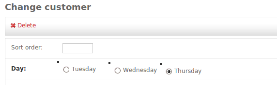
When I override the add/change form in my ModelAdmin, and subsequently set a field in that ModelForm to use the RadioSelect widget instead of the default Select, the resulting display is not very good-looking in the admin app:
- Each subsequent radio input is a few pixels lower than the previous.
- Each radio input is preceded by an unattractive square bullet, top aligned.
I have attached an image showing this behaviour.
I also tried using the AdminRadioSelect widget, with the same result.
It would be nice if the admin CSS would handle this case in a more attractive way.
Attachments (1)
Change History (3)
by , 17 years ago
| Attachment: | ugly_radio.png added |
|---|
comment:1 by , 17 years ago
| Version: | 1.0 → SVN |
|---|
comment:2 by , 17 years ago
| Resolution: | → invalid |
|---|---|
| Status: | new → closed |
Ok, sorry, I'll just use ModelAdmin.radio_fields that I somehow missed.
Note:
See TracTickets
for help on using tickets.
Screenshot showing misaligned radio inputs and square bullets.