Opened 11 months ago
Last modified 4 months ago
#36529 assigned New feature
Improvement of the filter and model selection sidebar on the admin changelist page for mobile screens. — at Version 2
| Reported by: | Antoliny | Owned by: | Antoliny |
|---|---|---|---|
| Component: | contrib.admin | Version: | dev |
| Severity: | Normal | Keywords: | accessibility, changelist, sidebar |
| Cc: | Antoliny, Thibaud Colas, Tom Carrick, Sarah Abderemane, Eliana Rosselli | Triage Stage: | Accepted |
| Has patch: | no | Needs documentation: | no |
| Needs tests: | no | Patch needs improvement: | yes |
| Easy pickings: | no | UI/UX: | yes |
Description (last modified by )
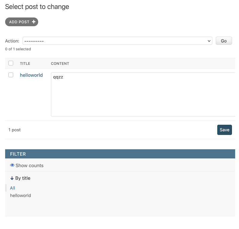
On the current changelist page, the model selection sidebar is set to display: none on mobile screen sizes, so it is not visible. In contrast, the filter sidebar is displayed at the bottom of the changelist.

In the above image, it's fine because the table has only one row. However, if the table contains multiple rows, it may be difficult to access the filter.
This layout can cause inconvenience to users and is something that I believe needs improvement.
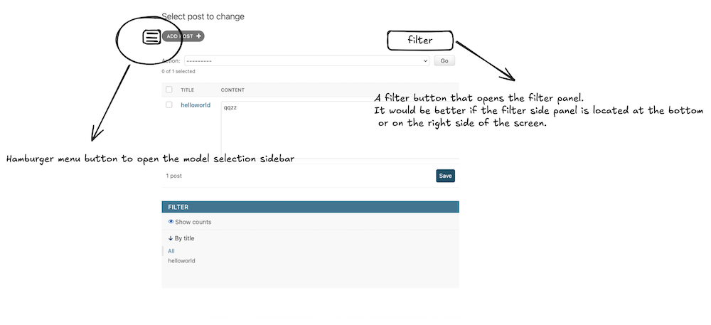
Also, I think it would be better if the model selection sidebar is available on mobile screens as well. Not providing certain features depending on the screen size can also cause inconvenience to users.

I think it would be good to add a button like the one above for the side panel, and have the side panel appear when that button is clicked.
However, I think further discussion is needed regarding the exact design.
Change History (4)
comment:1 by , 11 months ago
| Owner: | set to |
|---|---|
| Status: | new → assigned |
by , 11 months ago
| Attachment: | changelist_sidebar_mobile.png added |
|---|
by , 11 months ago
| Attachment: | changelist_sidebar_mobile_example.png added |
|---|
comment:2 by , 11 months ago
| Description: | modified (diff) |
|---|