Opened 23 months ago
Last modified 21 months ago
#35558 closed Uncategorized
Inline header style looks less prominent than inline content — at Version 2
| Reported by: | Sarah Boyce | Owned by: | Sarah Boyce |
|---|---|---|---|
| Component: | contrib.admin | Version: | 5.1 |
| Severity: | Release blocker | Keywords: | |
| Cc: | Triage Stage: | Accepted | |
| Has patch: | yes | Needs documentation: | no |
| Needs tests: | no | Patch needs improvement: | no |
| Easy pickings: | no | UI/UX: | no |
Description (last modified by )
Previously inline headers would always be a h4 but since #35189 these can be a h3.
This update has been done for a correct html structure and should not be reverted 👍
However the header has become less visually distinguishable from the content.
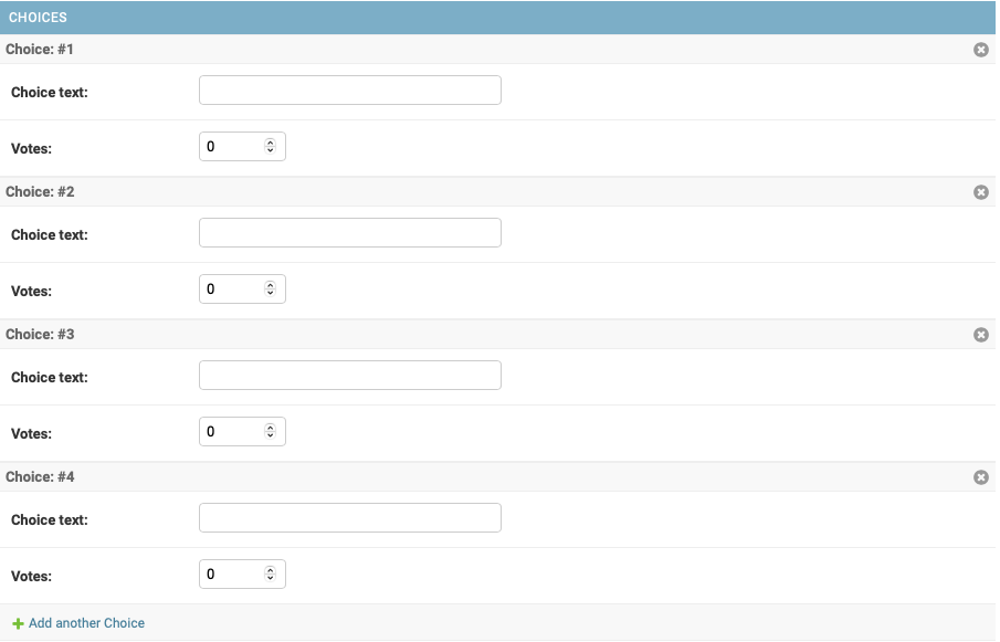
Previously (picture from docs):

Need to make the header look a bit "stronger"
Change History (4)
by , 23 months ago
| Attachment: | image-20240625-112423.png added |
|---|
by , 23 months ago
| Attachment: | image-20240625-112612.png added |
|---|
comment:1 by , 23 months ago
| Description: | modified (diff) |
|---|---|
| Has patch: | set |
comment:2 by , 23 months ago
| Description: | modified (diff) |
|---|---|
| Summary: | Inline header styling regression → Inline header style looks less prominent than inline content |
Note:
See TracTickets
for help on using tickets.
