#35189 closed Cleanup/optimization (fixed)
Accessibility issues with collapsed fieldsets in admin forms
| Reported by: | Thibaud Colas | Owned by: | Marijke Luttekes |
|---|---|---|---|
| Component: | contrib.admin | Version: | dev |
| Severity: | Normal | Keywords: | accessibility, whcm, forced colors, screen reader, forms, admin |
| Cc: | Tom Carrick, Sarah Abderemane | Triage Stage: | Ready for checkin |
| Has patch: | yes | Needs documentation: | no |
| Needs tests: | no | Patch needs improvement: | no |
| Easy pickings: | no | UI/UX: | yes |
Description (last modified by )
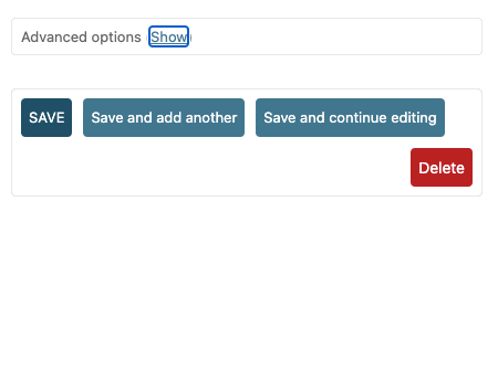
There are a number of issues with the "collapsible fieldset" in admin forms. This can be most easily tested on flatpages, with the "Advanced options" fields. Here’s a Change flat page demo page. And a screen recording of the widget:

I think there are enough problems that it makes sense to fix it all in one go, though the issues are technically separate.
Accessibility bugs
- The toggle should be a
<button>, not a link, so screen reader and WHCM users understand what the element is for more easily. - The toggle needs an
aria-expandedattribute set to true or false based on its current state, so screen reader users know what the state of the element is. See the APG disclosure pattern for further information. - The
<fieldset>element should have a<legend>, so the fields are understood to be grouped for screen reader users. - The toggle must have a minimum size of 24x24, so it’s easier for users with low-precision pointing devices or low mobility to hit it.
- The toggle shouldn’t change size based on the length of text within (in English show/hide is very close, in other languages not necessarily).
- The toggle’s appearance must be distinguished from other heading text via other means than color, so colorblind users can spot it.
- In the active state, it’s impossible to tell the toggle apart from the other header text.
- The collapsible heading is a
<h2>, even though the whole form itself is titled with an<h2>. It should be an<h3>instead so screen reader users have a more accurate representation of the page’s hierarchy. - In forced colors mode, it’s much harder to spot the location of the collapsible section header/heading, as background colors aren’t shown.
Styling issues
While we’re at it there are also styling issues which I think could be fixed at the same time:
- The collapsible section heading’s left edge isn’t aligned with the left edge of other form fields’ labels (8px left padding vs. 10px elsewhere)
- The collapsible section heading should have a font size at least as large as the field labels within, so the visual hierarchy is clearer.
- In the active state, the collapsible section header’s styles change too drastically. It doesn’t need to call for attention so much, when the user’s focus should be on what was revealed. Ideally the toggle’s styles would be different, as that’s the key UI element that’s in a different state.
- It seems odd the collapsible section header looses its rounded corners when in the active state.
- In forced colors mode, it’s distracting that the position of the heading / toggle shifts due to the collapsible header area border disappearing.
Solution
I think this is a good candidate for a full rebuild, which could keep some of the visual cues of the existing component but there are enough accessibility issues to address that it could also be more different. The new version should:
- Either use a
<details>and<summary>element for the collapsing, or implement the APG disclosure pattern to spec. - Preserve any bespoke logic of the current component to show/hide based on form state (don’t collapse if there are form errors within?)
- Use a
<h3>for the heading and<legend>for the heading (probablysummary > h3 > legendorbutton > h3 > legendbut TBC) - Use a fixed-size toggle – possibly with a visual device such as a caret to convey the state without use of color. Ideally the whole section header area would be clickable.
- Look and work great for all of the admin’s supported assistive technologies.
There could be some value in using <details> so this all works without JS, though we’d need to make sure to still support any JS-dependent behavior of the collapsible section.
Attachments (1)
Change History (17)
by , 2 years ago
| Attachment: | collapsed-fieldset-django.gif added |
|---|
comment:1 by , 2 years ago
| Description: | modified (diff) |
|---|
comment:3 by , 2 years ago
| Triage Stage: | Unreviewed → Accepted |
|---|---|
| Type: | Bug → Cleanup/optimization |
| Version: | 5.0 → dev |
Hello Thibaud, thanks for this report and its detailed content.
Accepting following the provided rationale. A few notes:
- Regarding the (loosing of the) rounded corners, I think we need to consider consistency with the "regular" fieldsets headings which are non rounded. Up to verification, I think we should remove the rounding altogether for this fieldset title. It seems the rounding comes from reusing the style of the action row, and then when active, the style comes from the usual fieldset legend.
- It's likely that we can get rid of the Javascript performing the toggle by using newest CSS selectors.
comment:4 by , 2 years ago
| Owner: | changed from to |
|---|---|
| Status: | new → assigned |
comment:5 by , 2 years ago
Regarding the (loosing of the) rounded corners, I think we need to consider consistency with the "regular" fieldsets headings which are non rounded. Up to verification, I think we should remove the rounding altogether for this fieldset title. It seems the rounding comes from reusing the style of the action row, and then when active, the style comes from the usual fieldset legend.
Agreed. When toggling the fieldset, the element also seems to move a pixel, which is visually unpleasing
I will switch to straight edges for these items.
It's likely that we can get rid of the Javascript performing the toggle by using newest CSS selectors.
My original idea for a fix does use a little JavaScript (no jQuery).
I will check with the accessibility team if they know of a better method, e.g., using a checkbox in HTML and the :checked CSS pseudo-class selector.
comment:6 by , 2 years ago
I have a draft PR out (without tests and release notes): https://github.com/django/django/pull/17910
I'm curious what you all think of this solution. It's based on one of my proofs of concept, which is mentioned in the first message of the PR.
comment:7 by , 2 years ago
| Has patch: | set |
|---|
comment:8 by , 2 years ago
| Patch needs improvement: | set |
|---|
I can see the accessibility team also has this in their review queue: https://github.com/orgs/django/projects/7, so hopefully you will receive another review soon.
comment:9 by , 2 years ago
| Patch needs improvement: | unset |
|---|
comment:10 by , 2 years ago
| Cc: | added |
|---|
comment:12 by , 2 years ago
| Triage Stage: | Accepted → Ready for checkin |
|---|
I'm setting this ticket as ready for checkin but I will review potential new feedback tomorrow, and after that I'll merge before the feature freeze happening in two days.
Screen recording of the "Advanced options" collapsible fieldset in flatpages change forms