Opened 2 years ago
Closed 21 months ago
#35404 closed Bug (fixed)
Admin fieldset multiple flexbox regressions
| Reported by: | minusf | Owned by: | |
|---|---|---|---|
| Component: | contrib.admin | Version: | 4.2 |
| Severity: | Normal | Keywords: | css admin fieldset accessibility |
| Cc: | minusf | Triage Stage: | Accepted |
| Has patch: | no | Needs documentation: | no |
| Needs tests: | no | Patch needs improvement: | no |
| Easy pickings: | no | UI/UX: | yes |
Description (last modified by )
Hello. I have noticed a couple regressions in the admin fieldset css. I think they are all related to switching <div class="form-row"> to flexbox.
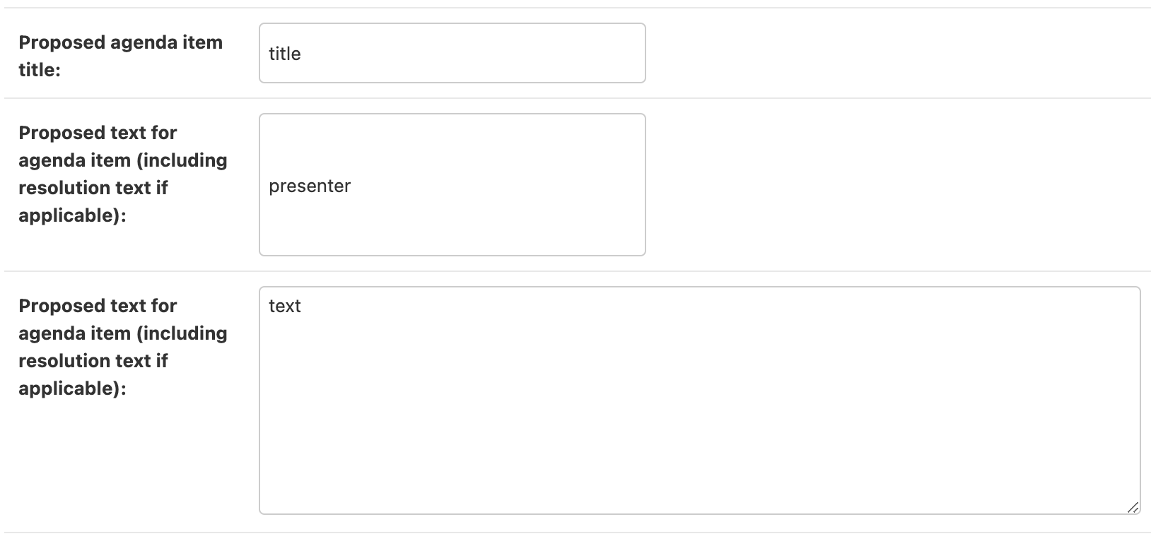
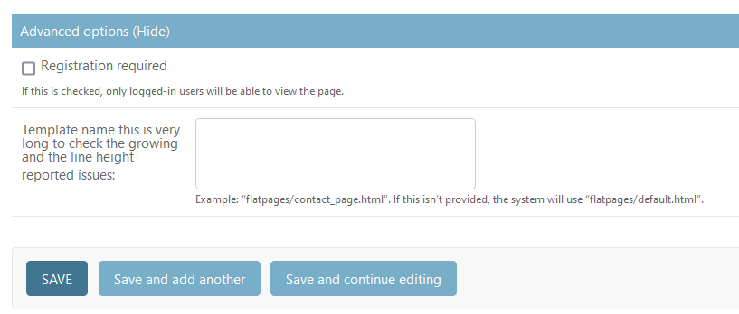
- input type=text boxes on the right side grow in height if the label doesn't fit into 160px.
- long labels have uncovered another issue: incorrect line height and a forced height in general. After applying the following patch:
M django/contrib/admin/static/admin/css/forms.css
@@ -84,14 +84,13 @@ form ul.inline li {
     min-width: 160px;
     width: 160px;
     word-wrap: break-word;
-    line-height: 1;
+    line-height: 1.5;
 }

 .aligned label:not(.vCheckboxLabel):after {
     content: '';
     display: inline-block;
     vertical-align: middle;
-    height: 1.625rem;
 }

 .aligned label + p, .aligned .checkbox-row + div.help, .aligned label + div.readonly {
long labels looks more readable:
- checkboxes are not aligned with their labels. I don't have a patch for this, only 2 screenshots:
with flexbox:
without flexbox:
Attachments (8)
Change History (26)
by , 2 years ago
| Attachment: | flexbox-input.png added |
|---|
by , 2 years ago
| Attachment: | long-labels-with-patch.png added |
|---|
by , 2 years ago
| Attachment: | unaligned-checkbox.png added |
|---|
by , 2 years ago
| Attachment: | checkbox-wo-flexbox.png added |
|---|
comment:1 by , 2 years ago
| Description: | modified (diff) |
|---|
by , 2 years ago
| Attachment: | image-20240425-090901.png added |
|---|
by , 2 years ago
| Attachment: | image-20240425-092610.png added |
|---|
comment:2 by , 2 years ago
| Triage Stage: | Unreviewed → Accepted |
|---|---|
| Version: | 5.0 → 4.2 |
comment:3 by , 2 years ago
Thank your for looking into this. Interesting that for so long nobody reported this.
I am sorry but I think the help_text is not helping much, personally my eyes are still bleeding ;-)
If you are happy with the patch for the height issue (no 2.), I can start a pull request and work from there.
The first couple of "fixes" I tried were not effective and it seems like I have to dive into flex myself much deeper as my understanding of it is flawed.
by , 2 years ago
| Attachment: | image-20240429-085114.png added |
|---|
comment:4 by , 2 years ago
If you are happy with the patch for the height issue (no 2.), ...
I think you can also remove the line-height
M django/contrib/admin/static/admin/css/forms.css
@@ -84,14 +84,13 @@ form ul.inline li {
     min-width: 160px;
     width: 160px;
     word-wrap: break-word;
-    line-height: 1;
 }

 .aligned label:not(.vCheckboxLabel):after {
     content: '';
     display: inline-block;
     vertical-align: middle;
-    height: 1.625rem;
 }
..., I can start a pull request and work from there.
Please do! I also think (2) should be a separate commit to (1) and (3) (maybe a commit message something like... Refs #35404 -- Fixed line height of admin fieldset labels.)
comment:5 by , 2 years ago
I think you can also remove the line-height
I might be wrong but afaik multiline paragraphs strongly benefit in readability with line-height at least 1.2 to 1.5 depending on font type... This is an actual issue in the admin how it shows help_text as well and I meant to send a patch for that for years...
by , 2 years ago
| Attachment: | admin-help-text.png added |
|---|
follow-up: 7 comment:6 by , 2 years ago
strongly benefit in readability with line-height at least 1.2 to 1.5 depending on font type
I agree 1 is too small 👍
In case I was misunderstood, for the css we were looking at line-height: 1; was overriding an existing larger line-height. Generally, I would like our css have good defaults and not have too much being overriden for particular classes/elements.
comment:7 by , 2 years ago
Replying to Sarah Boyce:
In case I was misunderstood, for the css we were looking at
line-height: 1;was overriding an existing larger line-height. Generally, I would like our css have good defaults and not have too much being overriden for particular classes/elements.
Yes, I see what you mean. Removing it sets line-height: normal (by user agent), which according to mdn is "a default value of roughly 1.2, depending on the element's font-family"...
comment:8 by , 2 years ago
| Has patch: | set |
|---|
follow-up: 10 comment:9 by , 2 years ago
Regarding help_text, I think that with this small font line-height: normal is not enough:
M django/contrib/admin/static/admin/css/base.css
@@ -268,6 +268,7 @@ hr {
 .help, p.help, form p.help, div.help, form div.help, div.help li {
     font-size: 0.6875rem;
     color: var(--body-quiet-color);
+    line-height: 1.5;
 }
·
 div.help ul {
comment:10 by , 2 years ago
| Keywords: | accessibility added |
|---|
Replying to minusf:
Regarding
help_text, I think that with this small fontline-height: normalis not enough:
M django/contrib/admin/static/admin/css/base.css
@@ -268,6 +268,7 @@ hr {
 .help, p.help, form p.help, div.help, form div.help, div.help li {
     font-size: 0.6875rem;
     color: var(--body-quiet-color);
+    line-height: 1.5;
 }
·
 div.help ul {
I don't think, taking into account the way the admin is already, this css change clearly fixes an issue/bug.
I think a wider discussion on whether the fonts and spacing in the admin is too small (with the accessibility team involved) is a good idea, but out of scope of this ticket.
There are many small tweaks we can make to css and there is a lot of subjectivity around what looks "better", so let's fix the issue as reported and create further discussions as necessary. Then the changes we make are scoped out and made to all required areas at once, rather than a series of many small tweaks requiring many reviews. I hope that makes sense 👍
comment:12 by , 2 years ago
| Has patch: | unset |
|---|
comment:13 by , 2 years ago
| Owner: | changed from to |
|---|---|
| Status: | new → assigned |
comment:14 by , 23 months ago
https://github.com/VaarunSinha/contribution-notes/blob/main/django/ticket_35404/notes.md
The checkbox issue has been fixed, and these are my contribution notes.
I will be committing and creating a PR soon.
comment:17 by , 21 months ago
| Owner: | removed |
|---|---|
| Status: | assigned → new |
comment:18 by , 21 months ago
| Resolution: | → fixed |
|---|---|
| Status: | new → closed |
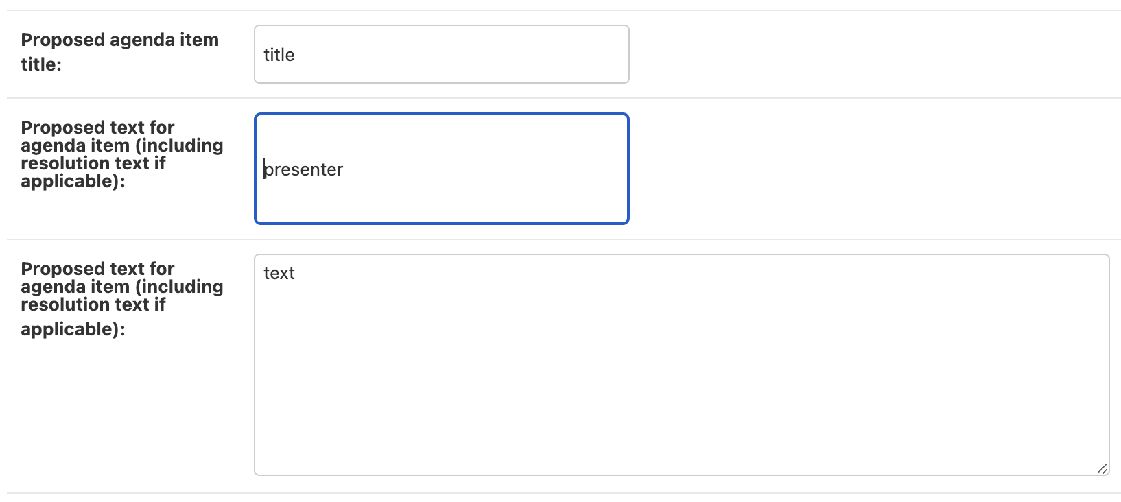

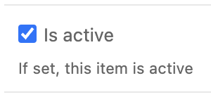
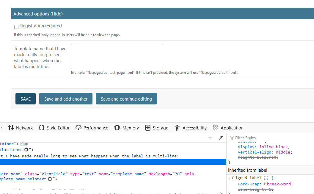

Thank you for the report and screenshots! Replicated 👍
For reference, this is how these examples looked on 4.1 (ignore the red dot)

1 and 3 are regressions from 96a598356a9ea8c2c05b22cadc12e256a3b295fd, 2 is a long standing issue.
Unsure what is the best option for 1, because the grow behaviour looks better when there is help text.
Happy to receive suggestions or to default to the previous behaviour.