Opened 4 years ago
Closed 3 years ago
#33728 closed Cleanup/optimization (fixed)
Tab order should match visual order for admin model forms’ submit buttons
| Reported by: | Thibaud Colas | Owned by: | Alexander Freyr Lúðvíksson |
|---|---|---|---|
| Component: | contrib.admin | Version: | dev |
| Severity: | Normal | Keywords: | accessibility, keyboard, ux |
| Cc: | Carlton Gibson, elky | Triage Stage: | Ready for checkin |
| Has patch: | yes | Needs documentation: | no |
| Needs tests: | no | Patch needs improvement: | no |
| Easy pickings: | no | UI/UX: | yes |
Description (last modified by )
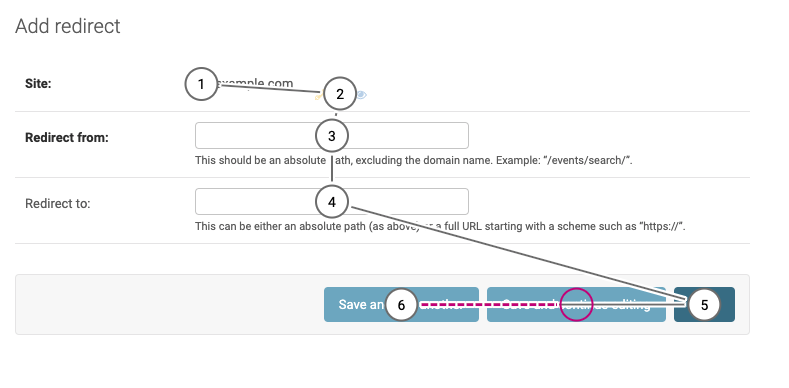
In the Django admin, in a model form, the tab order of the submit buttons is different from the visual order. Here is a screenshot of the tab stops:

In LTR languages, focus should follow the reading order of the page, top-to-bottom, left to right. Here, the correct focus order for those buttons would be:
- Save and add another
- Save and continue editing
- SAVE (not sure why this one is shouting)
We need to change the order of the buttons in the DOM so it matches the visual order. Or if we do want the default button to be reached first, then remove the styling that changes the visual order currently. I assume this implementation was done intentionally, but it’s confusing for keyboard users if focus moves counter to the expected sequential flow of the elements.
Attachments (2)
Change History (15)
by , 4 years ago
| Attachment: | tab-stop-modelform.png added |
|---|
comment:1 by , 4 years ago
| Description: | modified (diff) |
|---|
comment:2 by , 4 years ago
follow-up: 10 comment:3 by , 4 years ago
| Cc: | added |
|---|---|
| Triage Stage: | Unreviewed → Accepted |
| Type: | Bug → Cleanup/optimization |
I agree that it's confusing. The situation is even more complicate on edit views where we also have a Delete button. Moreover we need to remember about RTL languages. I'd reorder the buttons as follows:
- LTR:
Save,Save and add another,Save and continue editing,Delete, - RTL:
Delete,Save and continue editing,Save and add another,Save,
maybe with a small visual space before/after Delete (but I'm not a designer).
comment:4 by , 4 years ago
| Owner: | changed from to |
|---|---|
| Status: | new → assigned |
comment:5 by , 4 years ago
| Has patch: | set |
|---|
comment:6 by , 4 years ago
| Patch needs improvement: | set |
|---|
comment:7 by , 4 years ago
| Patch needs improvement: | unset |
|---|---|
| Triage Stage: | Accepted → Ready for checkin |
comment:9 by , 3 years ago
I'm not super familiar with Django's release notes policy, but this feels like something that could have been mentioned in the release notes for Django 4.2?
In my company, we got a bit surprised by this after having upgraded, at least!
by , 3 years ago
| Attachment: | Google that.jpg added |
|---|
comment:10 by , 3 years ago
Replying to Mariusz Felisiak:
I agree that it's confusing. The situation is even more complicate on edit views where we also have a
Deletebutton. Moreover we need to remember about RTL languages. I'd reorder the buttons as follows:
- LTR:
Save,Save and add another,Save and continue editing,Delete,- RTL:
Delete,Save and continue editing,Save and add another,Save,maybe with a small visual space before/after
Delete(but I'm not a designer).
I am replying because i was directed here. Whatever happened in this report in an attempt to fix the tabbing order the visual order was screwed up. (see https://code.djangoproject.com/ticket/347360). I don't know if I was directed here in error or if the visual order was changed to accommodate the tabbing order instead of vice versa. However the visual order is now incorrect, based on any other application I have ever used.
I believe this is incorrect, because a delete button should not be in the position of the confirm button in every other GUI paradigm ever. I am disappointed as a designer and a programmer in how this was handled.
(1)In LTR Paradigms
- Cancel is on the right if the resulting action could be considered detrimental if performed accidentally
- Confirm is on the right if this is normally desirable and easy to undo if performed in error.
- The auxiliary and/or destructive option is absolutely NEVER EVER in the right most slot, i.e. the usual place of the confirm button.
- The "auxiliary action" is opposite the main actions intentionally this is why "delete" was on the left, opposite where confirm buttons are in every program.
- The save button being the most common action found itself right-most, if you disagree with this placement, add an option, but don't just change it on a whim.
(2)An experimental change should not modify a legacy behaviour without the consent of the end-user. This is more often cited in in APIs but is just as relevant in UI.
- If you want to experiment with a new layout then, you should make it an option first, do not immediately roll it into a release.
- If the option should be off by default. If in a later version you turn it on by default because the community generally accepts it as good, you should still leave it in as an option for legacy customers who do not want it.
Please remedy the situation by adding something to the effect of
class ModelAdmin:
  class Meta:
    action_button_placement="classic" # or "reversed"

#settings.py
DJANGO_ADMIN=
{
  "action_button_layout":"classic"
}
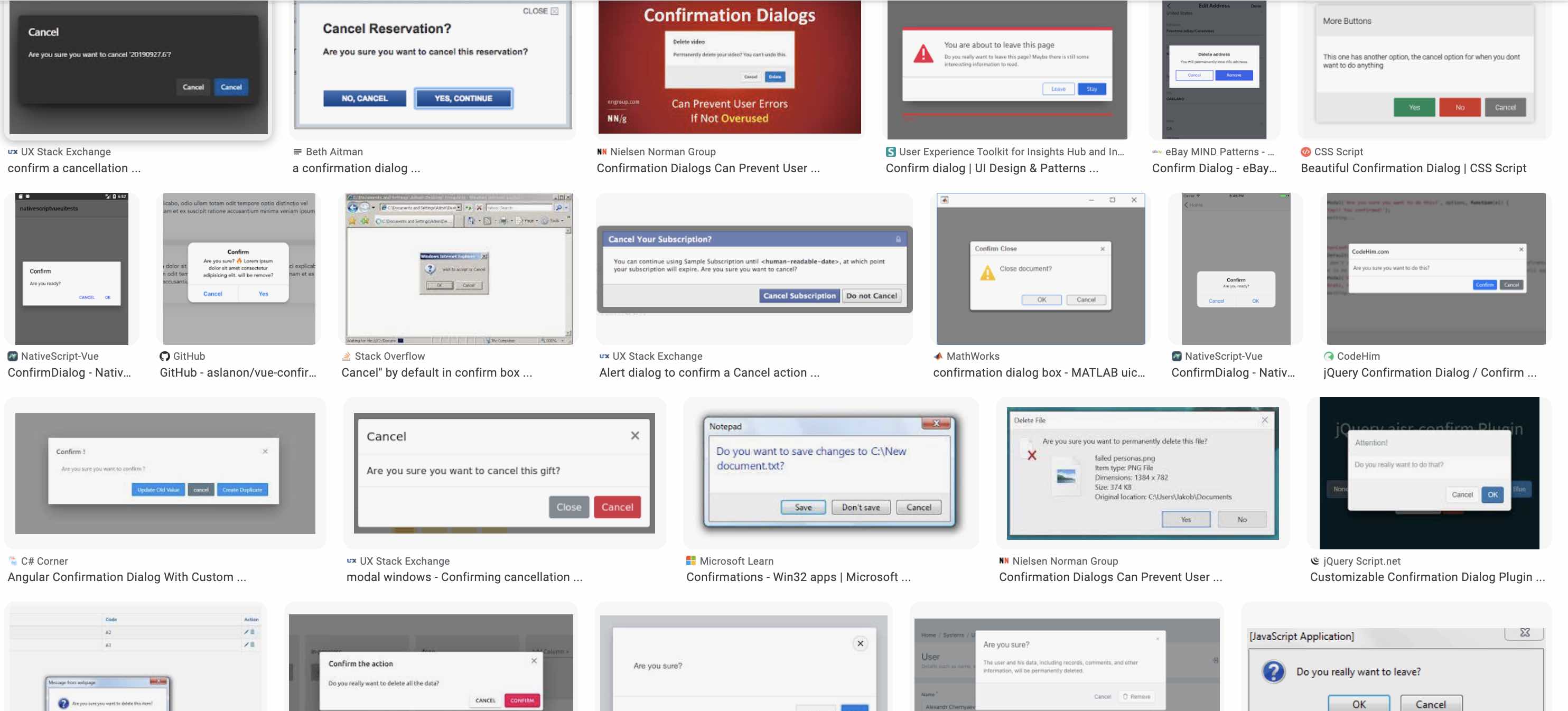
For reference I have attached a google image result for confirm cancel dialogs. To show typical orderings, which do not include the one which was mainlined.
comment:11 by , 3 years ago
| Resolution: | fixed |
|---|---|
| Status: | closed → new |
Replying to Thibaud Colas:
I believe that applying a tabindex attribute, which forces the button marked 6 to come before the button marked 5 is sufficient to fix the accessibility issue without a breaking change for people who like to click the buttons with the mouse.
I think that actually the best solution is probably for the tabbing preference to be set int the settings.py. While obviously the ideal order is probably not to put delete first. I think that the order that someone who is visually impaired might want to traverse the form is going to be up to their workflow preference. If they want to create a lot of objects with manual entry, then it should flow from left to right. But if their job involves opening an existing customer record, making changes, and then saving it back, it would be preferable to have the save button first.
In the Django admin, in a model form, the tab order of the submit buttons is different from the visual order. Here is a screenshot of the tab stops:
In LTR languages, focus should follow the reading order of the page, top-to-bottom, left to right. Here, the correct focus order for those buttons would be:
- Save and add another
- Save and continue editing
- SAVE (not sure why this one is shouting)
We need to change the order of the buttons in the DOM so it matches the visual order. Or if we do want the default button to be reached first, then remove the styling that changes the visual order currently. I assume this implementation was done intentionally, but it’s confusing for keyboard users if focus moves counter to the expected sequential flow of the elements.
comment:12 by , 3 years ago
Interesting topic! Below my thoughts on this.
A year ago, when I noticed this change (as a user, not as a fellow), I was quite surprised and annoyed because my hands were used to submit Save actions in the rightmost side of the screen. But I said nothing because I assumed the change was necessary. Now that I see the newer comments, I started doing some research and found a few interesting artciles (lots of TILs):
This one says "Left aligning the primary action will ensure that it comes first whether buttons are inline or stacked."
This other one is a bit more involved and presents multiple cases, but in general they advise to place the buttons to the left.
The latter references this article from "LukeW" though, despite it's from 2007, the analysis it makes is quite compelling and does not seem outdated at all.
It's worth noting that the attached screenshot seems to be about confirmation dialogs, not about form submit buttons placement, and I don't think they should be treated the same.
In summary, my vote is to leave the buttons in the current location, though I would suggest that we could reduce the number of actions because it feels convoluted. Specifically, I think one simple improvement would be to transform the Delete red prominent button into making it a link, following this advice:
While the primary goal of most Web form designs is to get people through a form as quickly and painlessly as possible, there are situations where slowing people down is advisable. When choosing between primary and secondary actions, visual distinctions are a useful method for helping people make good choices. Should this distinction be more prominent like the button vs. link in Option A or a bit more subtle like the two different colored buttons in Option C? Option A fared a bit better in time to completion, average number of fixations, and average total length of fixations indicating people completed the form faster but not by much.
comment:13 by , 3 years ago
| Resolution: | → fixed |
|---|---|
| Status: | new → closed |
@awiebe please do not reopen this ticket because "closed" matches the current status. If we, eventually decide to change anything, we'd be likely creating a new ticket. Thanks!
Yes, I agree with you. I have made several mistakes before because of this design decision. I think the order should be "save", "save and add another", and "save and continue editing" respectively. I would like to work on this issue if gets accepted.