Opened 5 years ago
Closed 5 years ago
#32999 closed Uncategorized (needsinfo)
Admin Tabular Stacked Inline widget headings are not aligned headings
| Reported by: | Michael | Owned by: | nobody |
|---|---|---|---|
| Component: | contrib.admin | Version: | 3.2 |
| Severity: | Normal | Keywords: | tabularinline css style styling |
| Cc: | Triage Stage: | Unreviewed | |
| Has patch: | no | Needs documentation: | no |
| Needs tests: | no | Patch needs improvement: | no |
| Easy pickings: | yes | UI/UX: | no |
Description (last modified by )
https://code.djangoproject.com/attachment/ticket/32999/inline%20tabular.png
With the following model:
class ApplicantAdmin(admin.TabularInline):
    model = Application.applicant_set.through

@admin.register(Application)
class ApplicationAdmin(admin.ModelAdmin):
    exclude = ('applicant_set', )
    inlines = (ApplicantAdmin, )
The heading Delete? is on the left, however the delete button is on the right, making it confusing for some people.
Another issue is if the stacktabular has many fields:
Instead of the stacked tabular getting overflow x scroll, the whole page does:
https://code.djangoproject.com/attachment/ticket/32999/notaligned.png
Attachments (3)
Change History (7)
by , 5 years ago
| Attachment: | notaligned.png added |
|---|
comment:1 by , 5 years ago
| Description: | modified (diff) |
|---|
comment:2 by , 5 years ago
| Description: | modified (diff) |
|---|
by , 5 years ago
| Attachment: | inline tabular.png added |
|---|
comment:3 by , 5 years ago
| Description: | modified (diff) |
|---|
by , 5 years ago
| Attachment: | Screenshot 2021-08-10 at 08.49.16.png added |
|---|
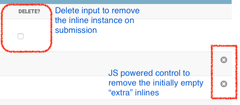
Screenshot from admin showing Delete input and remove "extra" inline controls.
comment:4 by , 5 years ago
| Resolution: | → needsinfo |
|---|---|
| Status: | new → closed |
Hi Michael. Thanks for the report.
Just to clarify, there are two controls in play here:
The "Delete?" header corresponds to the checkbox input that controls whether the existing inline instance should be deleted.
The "X" marks are JavaScript powered, and allow deleting the initially empty "extra" inlines.
Those shouldn't line up.
In your "wider" example, they are being squashed together for lack of space, but I wonder if/what we'd be able to do about that… 🤔
In your screenshots the checkboxes for delete are not showing — how exactly is that coming up? Do you have can_delete=False set, or are there restricted permissions in play? (etc)
It may be that we could optimise to not show the Delete? header at all in this case.
Can I ask you to provide a fuller example (perhaps a sample project?) recreating this?
Thanks again!

If it is quite wide