Opened 8 years ago
Closed 7 years ago
#29995 closed Cleanup/optimization (fixed)
Make the technical error response more legible when using high contrast mode
| Reported by: | Matthew Pava | Owned by: | Zach Garwood |
|---|---|---|---|
| Component: | Error reporting | Version: | 2.1 |
| Severity: | Normal | Keywords: | |
| Cc: | Triage Stage: | Ready for checkin | |
| Has patch: | yes | Needs documentation: | no |
| Needs tests: | no | Patch needs improvement: | no |
| Easy pickings: | no | UI/UX: | no |
Description (last modified by )
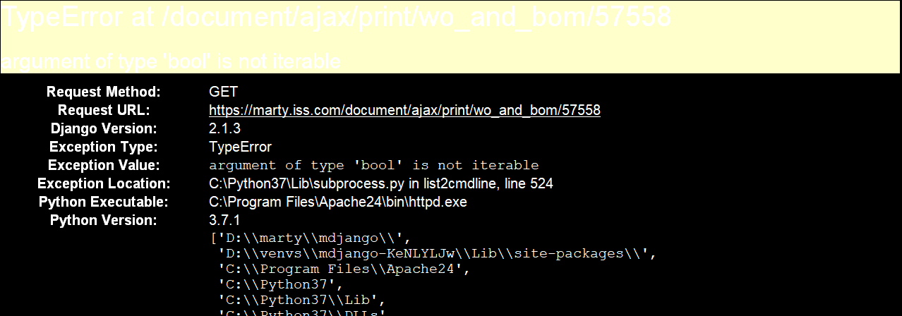
I really appreciate the error response, but I recently switched my display to high-contrast mode. Unfortunately, the default color scheme for the response template is not legible in high contrast mode. I envision two paths here: Either allow full customization of the technical error response template or choose a color scheme that will work effectively in high-contrast mode and non-high-contrast mode. I've added a screenshot so that you can see what I'm seeing.
Attachments (4)
Change History (12)
by , 8 years ago
| Attachment: | high-contrast-mode.png added |
|---|
comment:1 by , 8 years ago
| Description: | modified (diff) |
|---|
comment:2 by , 8 years ago
| Summary: | Customize Technical Error Response Template → Make the technical error response more legible when using high contrast mode |
|---|---|
| Triage Stage: | Unreviewed → Accepted |
I don't have knowledge about how high contrast mode works but I guess it should be possible for things to "just work".
comment:3 by , 8 years ago
| Owner: | set to |
|---|---|
| Status: | new → assigned |
I'm currently learning more about accessibility best practices and would love to tackle this issue.
comment:4 by , 8 years ago
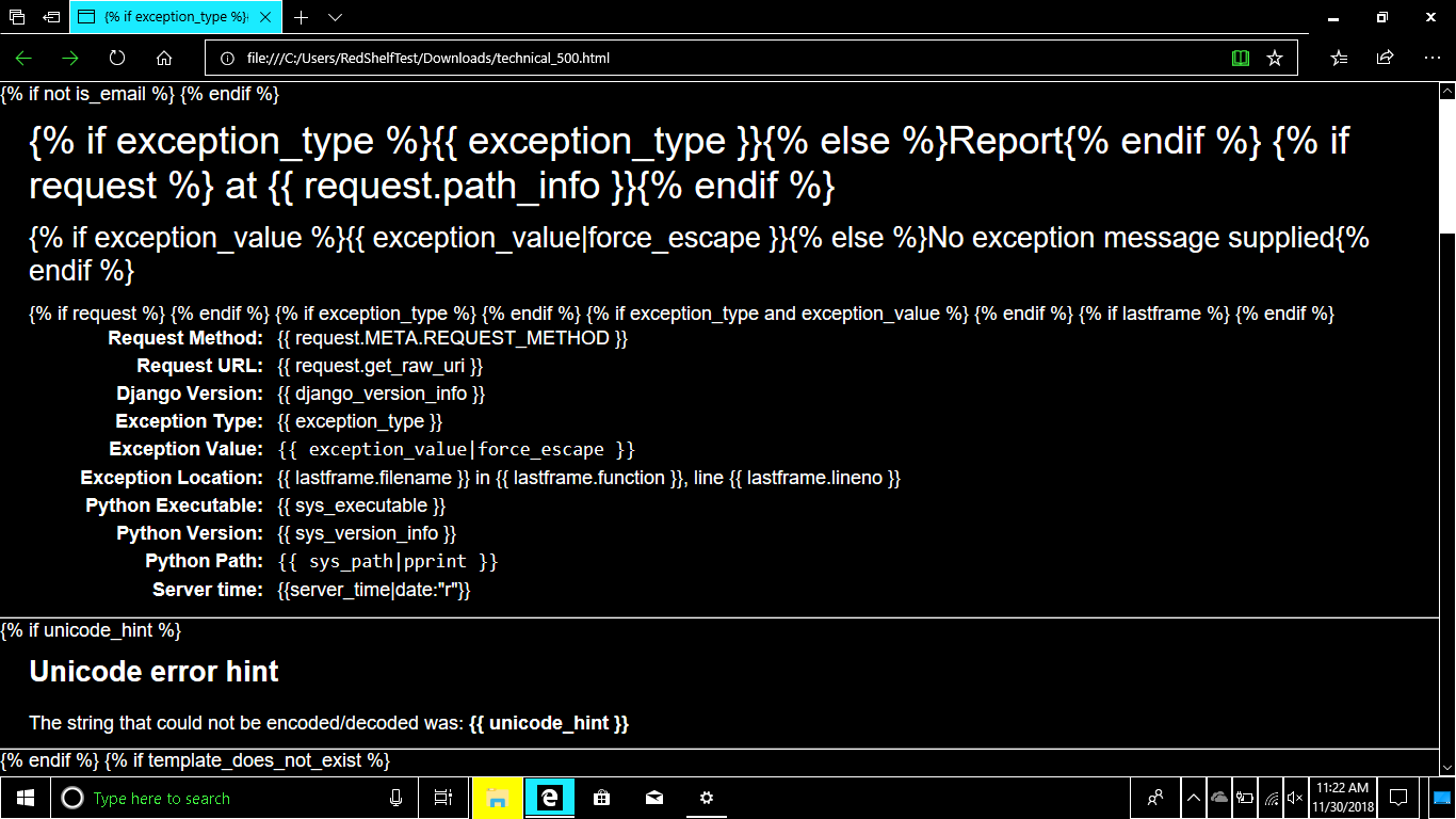
Matthew, I think there may be an issue with your assistive tool. I took screenshots using the built-in high contrast modes for Windows and MacOS, as well as the official Chrome extension (see below), and they all seemed to handle the pale yellow at the top of the page reasonably well. Matthew, is it possible that your tool is misconfigured or possibly buggy?
All that being said, I looked at the text/background combinations found in that template and used an Accessible Colors tool recommended by the W3C's WCAG to determine how compliant they are:
- #000 / #ffc (black on pale yellow):
Passes AAA
Required contrast ratio: 4.5
Your contrast ratio: 20.43
- #666 / #ffc (dark grey on pale yellow):
Fails AAA
Required contrast ratio: 7
Your contrast ratio: 5.59
Passes AAA if you change text color to #575757
New contrast ratio: 7.03
- #000 / #eee (black on grey):
Passes AAA
Required contrast ratio: 7
Your contrast ratio: 18.1
- #000 / #f6f6f6 (black on light grey):
Passes AAA
Required contrast ratio: 7
Your contrast ratio: 19.43
- #666 / #eee (dark grey on light grey):
Fails AAA
Required contrast ratio: 7
Your contrast ratio: 4.95
Passes AAA if you change text color to #4F4F4F
New contrast ratio: 7.06
- #505050 / #dfdfdf (dark grey on another dark grey):
Fails AAA
Required contrast ratio: 7
Your contrast ratio: 6.05
Passes AAA if you change background color to #EFEFEF
New contrast ratio: 7.01
OR
Passes AAA if you change text color to #464646
New contrast ratio: 7.08
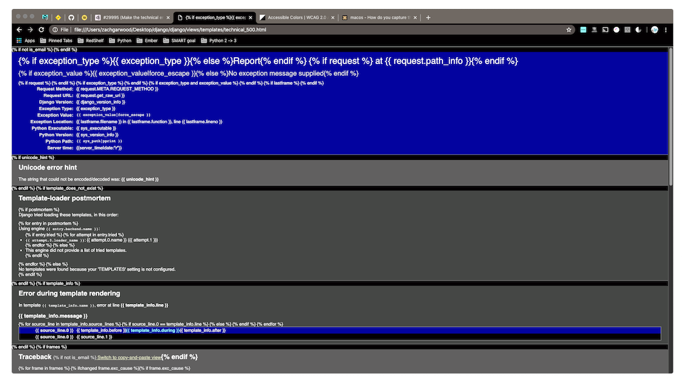
I've submitted a PR to address the failing low contrast color combinations.
Screenshots of various high contrast modes:
- Windows:

- MacOS:

- Chrome extension:

comment:5 by , 8 years ago
I should have done more thorough checking. The debug page does in fact produce legible results in the browser but not in Outlook 2010. Apparently, Outlook 2010 has issues with high-contrast mode. I was able to change to High-Contrast Mode 2 to make the admin email legible in Outlook 2010.
Thanks, @Zach!
comment:6 by , 8 years ago
| Resolution: | → invalid |
|---|---|
| Status: | assigned → closed |
comment:7 by , 7 years ago
| Has patch: | set |
|---|---|
| Resolution: | invalid |
| Status: | closed → new |
| Triage Stage: | Accepted → Ready for checkin |
Discussion on the PR yielded a consensus to use higher contrast colors, even if the original report isn't an issue.
Screenshot of high-contrast mode technical error page