Incorrect layout of ReadOnlyPasswordHashWidget widget in user admin
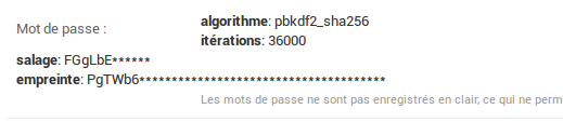
With the new template-based widget rendering, the admin password widget display is a bit awkward. See attached screenshot. Also, I'm not sure if the the nesting of divs is wanted.
Change History
(7)
| Component: |
contrib.admin → contrib.auth
|
| Owner: |
changed from nobody to Tim Graham
|
| Status: |
new → assigned
|
| Summary: |
Strange layout of password widget in user admin → Incorrect layout of ReadOnlyPasswordHashWidget widget in user admin
|
| Triage Stage: |
Unreviewed → Accepted
|
| Triage Stage: |
Accepted → Ready for checkin
|
| Resolution: |
→ fixed
|
| Status: |
assigned → closed
|
This looks like a regression to me.