Opened 14 years ago
Closed 13 years ago
#19550 closed Cleanup/optimization (fixed)
Make the filtered select widget wider
| Reported by: | Aymeric Augustin | Owned by: | nobody |
|---|---|---|---|
| Component: | contrib.admin | Version: | dev |
| Severity: | Normal | Keywords: | |
| Cc: | Triage Stage: | Ready for checkin | |
| Has patch: | yes | Needs documentation: | no |
| Needs tests: | no | Patch needs improvement: | no |
| Easy pickings: | no | UI/UX: | no |
Description
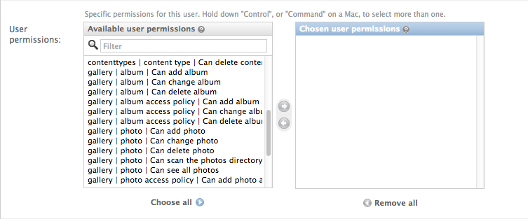
When editing users or groups permissions, often, the select widget crops the permission description. As shown on the screenshot attached to this ticket, cropping happens even for a model shipped by Django, namely ContentType. This isn't a very long name — 11 characters only.
The situation gets worse quickly when you have a long model name (eg. ScheduledMaintenance) and many custom permissions; it becomes very hard to differentiate them.
I think the widget was designed for 640px-wide screens. Nowadays I think we can aim for a minimum of 1024px. I'm attaching a patch.
Attachments (2)
Change History (6)
by , 14 years ago
| Attachment: | Capture d’écran 2013-01-02 à 16.25.37.png added |
|---|
by , 14 years ago
| Attachment: | 19550.patch added |
|---|
comment:1 by , 14 years ago
| Has patch: | set |
|---|---|
| Triage Stage: | Unreviewed → Accepted |
comment:2 by , 14 years ago
I chose the least invasive patch in order to minimize the risk of breaking the widget's layout — under the "if it ain't broken don't fix it" doctrine.
comment:3 by , 13 years ago
| Triage Stage: | Accepted → Ready for checkin |
|---|
comment:4 by , 13 years ago
| Resolution: | → fixed |
|---|---|
| Status: | new → closed |
What about using percentages instead of pixels?