#16059 closed Cleanup/optimization (fixed)
FilteredSelectMultiple "remove" button appears disabled
| Reported by: | Anders Hovmöller | Owned by: | nobody |
|---|---|---|---|
| Component: | contrib.admin | Version: | 1.3 |
| Severity: | Normal | Keywords: | |
| Cc: | Triage Stage: | Accepted | |
| Has patch: | yes | Needs documentation: | no |
| Needs tests: | no | Patch needs improvement: | no |
| Easy pickings: | no | UI/UX: | yes |
Description
The color choice for the remove buttons for FilteredSelectMultiple is unfortunate. Multiple times when looking at someone doing a demo of a site that used this control I see them hesitate before clicking the button, even though they have used it multiple times before. The reason is that the gray color when viewed in opposition to the blue looks like it's disabled.
Attachments (6)
.png)
.png)
Change History (23)
comment:1 by , 15 years ago
| Easy pickings: | unset |
|---|---|
| Triage Stage: | Unreviewed → Design decision needed |
by , 15 years ago
| Attachment: | 16059-filteredselectmultiple-better-ui.diff added |
|---|
comment:2 by , 15 years ago
| Has patch: | set |
|---|
So I've had a play with this. I've replaced all the grey icons with their blue equivalents. I've also added a help text under the search box on the left panel. Now there are two help texts:
- "To add, select your choice(s) and click =>"
- "To remove, select your choice(s) and click <="
See a screenshot here: https://skitch.com/julienphalipkayamb/fyw4b/filteredselectmultiple-ui-improvement
comment:3 by , 15 years ago
The boxes should probably be the same height, but that looks much more usable!
comment:4 by , 15 years ago
My Skitch account name has been changed. Here's the link again: http://skitch.com/julienphalip/fyw4b/filteredselectmultiple-ui-improvement
comment:5 by , 15 years ago
| UI/UX: | set |
|---|
comment:6 by , 15 years ago
| Component: | User Experience → contrib.admin |
|---|
by , 15 years ago
| Attachment: | 16059-filteredselectmultiple-better-ui.2.diff added |
|---|
comment:7 by , 15 years ago
| Triage Stage: | Design decision needed → Accepted |
|---|
I've made a number of usability improvements in the latest patch:
- The word "choose" is replaced with "add", and the word "clear" with "remove".
- Added tooltips (
titleattributes). - The "Add all" icon is now right-aligned.
- The boxes have the same size in horizontal mode.
- Made help texts more explicit.
comment:8 by , 15 years ago
By the way, the patch contains some binary images and so you'd need to use git apply:
git apply ~/Downloads/16059-filteredselectmultiple-better-ui.2.diff
comment:9 by , 15 years ago
I forgot to mention another important improvement: the icons appear active (i.e. blue) only if some items are selected in the boxes, respectively only if the boxes aren't empty for the "Add all" and "Remove all" links.
comment:10 by , 15 years ago
I think your dynamic button color solution is nice. I guess the gray "remove" button was originally designed that way to indicate "removal"; not sure whether it matters that this visual cue would be removed. Gray was never a good idea, but red/green would potentially be ugly. I'm happy enough with blue myself, but a UI expert might say otherwise.
I've only got Chrome handy for testing, but would be interested to see if the inline-block rules hold up in IE.
I think the "To add ..., select some choice(s) below and click the "Add" button" tips are useful, but I don't like how much space they take up; I wonder if they could be hidden in "help/?" buttons or tooltips or something?
by , 15 years ago
| Attachment: | 16059-filteredselectmultiple-better-ui.3.diff added |
|---|
by , 15 years ago
| Attachment: | Better FilteredSelectMultiple.png added |
|---|
Screenshot for patch 16059-filteredselectmultiple-better-ui.3.diff
comment:11 by , 15 years ago
Thanks for your feedback, Simon. I've made the help texts available as tooltips to avoid clutter (see attached screenshot).
I'm now planning to put all those arrow icons into a single sprite file to save bandwidth and to display faster. In the process I'd also like to delete the original individual icon files -- it is possible that people already use them to customise their admin, so we'd have to mention it in the release notes so that they get replacement files and serve them separately outside the default admin media.
I also need to add the new translation strings for the new help texts.
Any more feedback welcome! :)
comment:12 by , 15 years ago
By the way, so far I've manually tested with IE7+8 and Chrome+Safari+Firefox for the Mac successfully. More manual testing on other browsers or platforms is also welcome.
by , 15 years ago
| Attachment: | FilterSelectMultiple (Original).png added |
|---|
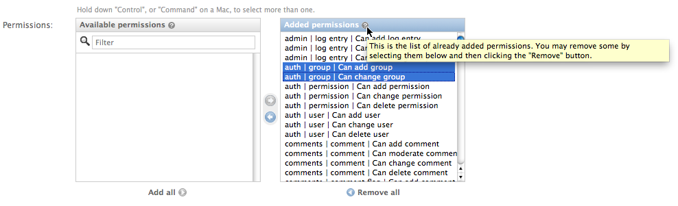
FilteredSelectMultiple widget as before the fix
comment:13 by , 15 years ago
Looks good to me for now.
Future stuff I'd like to consider: we have a filterbox on the left, but not on the right. I thought about it for a while, and couldn't rationalize why. For now, we should commit this.
Awesome work, Julien. :)
comment:14 by , 15 years ago
Thanks for the review, Idan! I too have been wondering about the absence of a filterbox on the right hand side. It is less than ideal especially since there could easily be dozens of selected items on the right as well as on the left. The main explanation I could come up with is that it may be confusing for some users to have some data saved in the database but visually hidden in the widget. Imagine: there's a bunch of items selected on the right for an existing object, you filter it (and therefore some items get hidden), you press save, and all the items reappear there on the right.
Anyway, I agree that it's best to opt for the status quo for this particular filterbox question, and perhaps tackle it in a separate ticket with other related redesign questions. I'll continue doing some testing and minor refinements with this patch and will commit it if it can reach a stable and solid state. Anyone please still feel free to jump in with ideas.
by , 15 years ago
| Attachment: | 16059-filteredselectmultiple-better-ui.4.diff added |
|---|
comment:15 by , 15 years ago
OK, this patch is now candidate for checkin. I've already successfully tested it with multiple browsers. I'll continue doing some more testing and will eventually check it in. In the meantime feel free to give it a whirl.
comment:17 by , 15 years ago
My apologies for forgetting to thank in the commit message 'boxed', Simon Meers and Idan Gazit for their suggestions and feedback.
I agree that this is not ideal. Also, the fact that "Select your choice(s) and click" appears on the right hand side isn't particularly great either. I definitely think there's room for improvement -- needs some more design discussion.