Opened 6 years ago
Last modified 4 years ago
#32338 closed Bug
Accessibility issues with Django forms RadioSelect and CheckboxSelectMultiple — at Version 4
| Reported by: | Thibaud Colas | Owned by: | nobody |
|---|---|---|---|
| Component: | Forms | Version: | dev |
| Severity: | Normal | Keywords: | accessibility, forms, wcag |
| Cc: | Triage Stage: | Accepted | |
| Has patch: | yes | Needs documentation: | no |
| Needs tests: | no | Patch needs improvement: | yes |
| Easy pickings: | no | UI/UX: | yes |
Description (last modified by )
In the Forms API, there are issues with the default rendering of fields that rely on widgets based on multiple radio or checkbox inputs: RadioSelect and CheckboxSelectMultiple. This is with the default rendering of those widgets, and with the custom rendering examples in the official documentation. Here is a form I set up for my testing of the default rendering:
- Live form: http://django-admin-tests.herokuapp.com/forms/example_form/p/
- Form fields definitions: https://github.com/thibaudcolas/django_admin_tests/blob/main/django_admin_tests/forms.py
- Template: https://github.com/thibaudcolas/django_admin_tests/blob/main/django_admin_tests/templates/django_admin_tests/example_form.html
RadioSelect issues
- The fields aren’t semantically grouped, only visually, so the grouping isn’t apparent to assistive technlogies. It’s important that related fields are grouped, and that the group has a label attached to it. If I was auditing this professionally I would classify this as a fail for SC 1.3.1 - Info and Relationships of WCAG 2.1, as the grouping and label are somewhat there, just not done with the appropriate semantics.
- Speaking of label – currently the group of fields is labeled by preceding it with
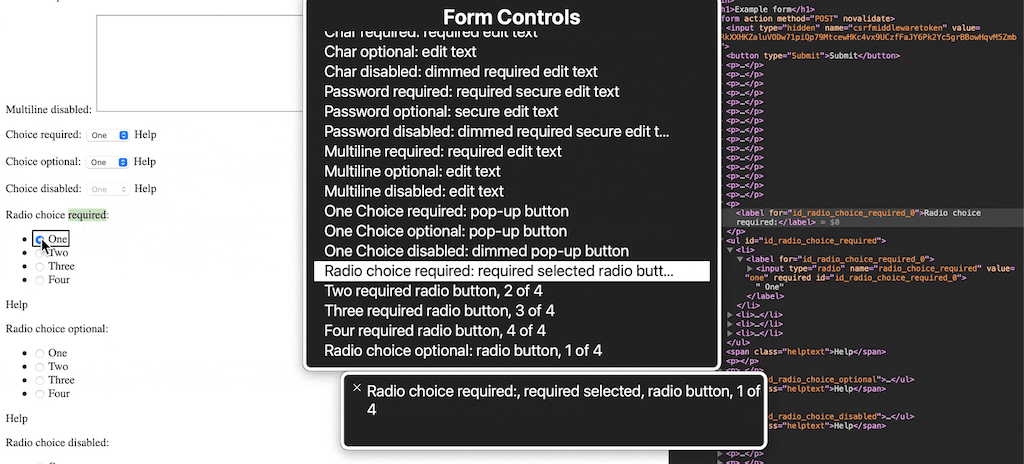
<label for="id_radio_choice_required_0">Radio choice required:</label>. This overrides the label of the first field within the group (and only labels the first field, not the whole group). This is a fail for 3.3.2: Labels or Instructions and/or SC 1.3.1. - Wrapping the fields each in their own list item makes the navigation more tedious, as screen readers will first announce list items numbering, and only then their content.
Here is a screenshot demonstrating the label issue with macOS VoiceOver’s rotor. Note how the first field has the wrong label due to the markup.

CheckboxSelectMultiple issues
Almost identical to the above,
- Lack of a fieldset means no semantic grouping.
- The label isn’t associated with anything for this widget, so is less problematic but no more correct.
- Wrapping the fields in list items also makes the form more verbose than it should be (and the semantics issues are the same).
Documentation issues
Additionally to the above, there are a few occurences of custom radio/checkbox markup in the documentation that will lead to the same issues:
- https://docs.djangoproject.com/en/3.1/ref/forms/widgets/#radioselect
- https://docs.djangoproject.com/en/3.1/intro/tutorial04/#write-a-minimal-form
Proposed solution
Essentially following technique H71 of WCAG. The ideal solution is identical for both widgets, and also for documentation code snippets:
- Wrap the group of fields in a
fieldset, including the group’s label, the inputs, the help text, and any errors. - Use a
legendas the first item in thefieldsetfor the group’s label, rather than alabel. - Replace the list markup with un-semantic div, or remove altogether. If the list markup is needed for backwards compatibility, it could also use
role="presentation"so assistive technologies ignore the list & listitem semantics, but I would only recommend that as a temporary workaround.
Here is sample markup to implement the above. The div aren’t needed, I’ve only added them to preserve the vertical layout of the current implementation:
<fieldset>
    <legend>Radio choice required:</legend>
    <div><label for="id_radio_choice_required_0"><input type="radio" name="radio_choice_required" value="one" required="" id="id_radio_choice_required_0">
 One</label></div>
    <div><label for="id_radio_choice_required_1"><input type="radio" name="radio_choice_required" value="two" required="" id="id_radio_choice_required_1">
 Two</label></div>
    <div><label for="id_radio_choice_required_2"><input type="radio" name="radio_choice_required" value="three" required="" id="id_radio_choice_required_2">
 Three</label></div>
    <div><label for="id_radio_choice_required_3"><input type="radio" name="radio_choice_required" value="four" required="" id="id_radio_choice_required_3">
 Four</label></div>
    <span class="helptext">Help</span>
</fieldset>
Change History (5)
by , 6 years ago
| Attachment: | radio-select-first-input-label.png added |
|---|
comment:1 by , 6 years ago
| Description: | modified (diff) |
|---|
comment:2 by , 6 years ago
| Description: | modified (diff) |
|---|
comment:3 by , 6 years ago
| Description: | modified (diff) |
|---|
comment:4 by , 6 years ago
| Description: | modified (diff) |
|---|
Screenshot of a RadioSelect widget, with DevTools open to see the markup, and VoiceOver rotor menu showing the Form Controls’ labels